The Challenge

Turning Star wanted a new look to match a new service initiative.
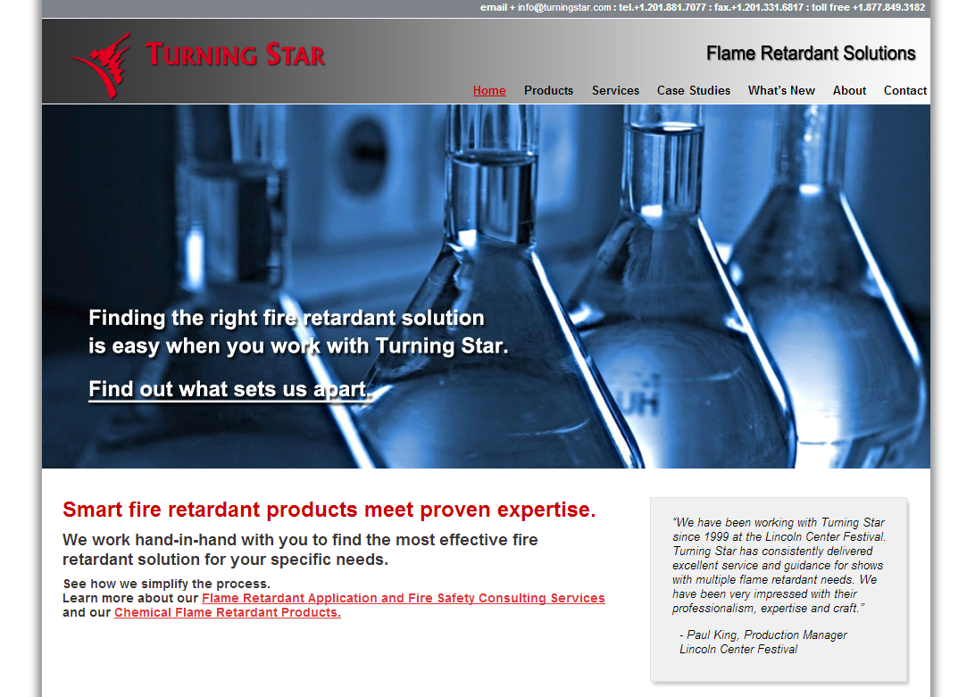
- The site was fine for a small service business, but their 2009 style needed to change.
- They weren’t taking advantage of responsive layouts.
- Their message needed to speak directly to who they thought their target market would be.
- The blog needed to be active and do more than showcase old case studies.
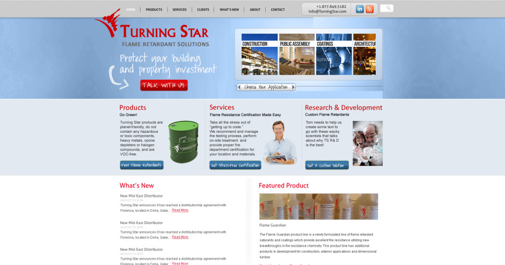
This was the final mock-up we thought we’d build to brighten up the look and highlight their new R&D effort.
 However, their industry analysis suggested a change of strategy and the design was put on hold.
The Solution
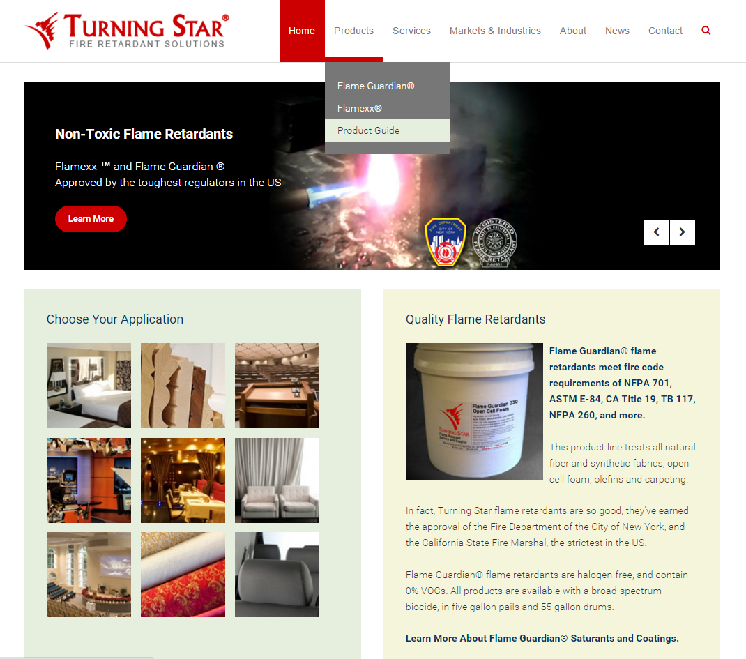
Turning Star’s latest site design focuses their message.
- We had always refrained from using images of fire, and this design uses static and video images to demonstrate the effectiveness of Turning Star’s non-toxic products.
- The home page slider controls are manual instead of automatic, so it presents as a static image and let’s the user choose.
- Videos of their portfolio and testing processes, as well as badges from fire prevention regulators, prove the company’s quality.
- The response from RFQ forms on every page quantify the effectiveness of the redesign.
- Implementation of a content marketing campaign, including blog posts, has reinforced Turning Star’s position as a leader in their field.
“We have relied on Little Fish Studios, and Marjorie’s marketing expertise since 1999 – 15+ years, two locations, and four designs ago. She always gives us her best recommendations, and designs for our current needs. Our strong online presence and growth in new customer acquisitions though our website are due to Marjorie’s ongoing efforts.”
Does Your Design Speak to YOUR Target Market?
A complementary consultation is yours for the asking.


